
BROCHURES & LAYOUT


Non Aligned - Brochure and deck
Non Aligned - Brochure and deck
Non Aligned - Brochure and deck
Non Aligned - Brochure and deck
Non Aligned - Brochure and deck
Non Aligned - Brochure and deck
Non Aligned - Brochure and deck
Non Aligned - Brochure and deck
8 - 8
<
>
Non Aligned
Developing identity assets
I was approached by the photography collective 'Non-Aligned' to produce an identity / portfolio piece to showcase their work to their clients.
Based in Kenya, my clients take pictures for a range of organisations and news groups including; Vice, The Guardian, New York Times and Al Jazeera.
I created a simple identity from their logo and a photography focused grid for this project, working on framing and pairing photos to enhance the book as a whole. The finished digital book is also interactive to help showcase their work further via news and video links.
Thameslink
Hotspot Student brochure
This project was designed to promote travel to different destinations in each issue. With a target audience of the, more sophisticated, modern student. But also lending itself to people who want to travel along the network.
I worked to create an identity that was relevant to its audience, editorial in style and which engaged with local businessness to give an authentic flavour of the area.
This is the only prototype in my folio.


Hotspots - Online magazine
Hotspots is designed as a destination guide
Links take you to the recommended destinations
To encourage travel and local businesses
Features for activities at different time of day
5 - 6
<
>
Since 2006 most of my day to day work has been layout based.
The range is huge; including brochures, newsletters, posters,
web, digital advertising, reports, catalogues, product guides and technical documents.
When producing these documents it's really important that both the client and the designer understand their common purpose.
Typically by asking:
- Who is the audience?
- What is the document trying to do (sell, inform etc)?
- When is it due - is it a short campaign or something that need to be around for a while?
- Where? How is it to be distributed, is your audience regional
- Is the format / type of document appropriate?
There follows a slideshow and a couple of sample projects and descriptions to add depth. For example; such as explaining the clients intended outcome or what made this project successful.
Right:
reVerb is a photography magazine prototype. I developed the layout, typography and identity of this magazine. You'll find some of the spreads in the slideshow below.
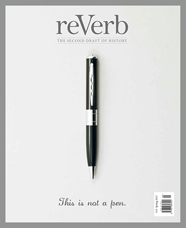


reVerb - magazine self publish project - working on Brand and Identity
Making finance approachable - Futurebuilders organisaton
Integrated home entertainment system - Layout design and photography
Sonata A5 brochure
Spreads from the reVerb magazine project
Transport for London - Adding some air into a text heavy finance document.
Groundwork East 6 Page brochure.
Performance - high end speaker brochure, worked on all visuals, cover concept
8 - 8
<
>
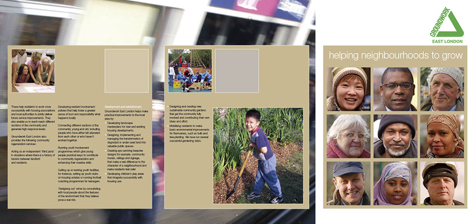
Groundwork East - 6 page
This one is here because its a favourite of mine. I undertook this project while at Source Communications (2006), an agency that specialised in working for Not-for-Profit, Local Government and Charity clients. I was working with a very talented lead designer called Toby Leetham who had an understanding of type and layout I have only seen once since, I really feel working with him brought a new dimension to my approach to layout and type.

